A visitor lands on your website — and within a fraction of a second decides whether to stay or leave. In that moment, the atmosphere of the page speaks louder than any copy. If your product lives on a screen — an app, a service, an interface — the way you present it directly affects conversion. This is exactly where a well-chosen iPad mockup stops being a design asset and becomes a sales tool.
Why Seasonality Is a Business Decision, Not Just Aesthetics
People buy emotionally. On Black Friday, they’re charged with urgency and deal-hunting energy. In January, they’re thinking about change and fresh starts. In summer, they want lightness and pleasure.
If your visuals don’t match that mood, you lose the connection with your audience. A generic, “evergreen” mockup in the middle of a holiday campaign sends a subtle signal: we weren’t thinking about you specifically right now. Seasonal adaptation is a gesture of attention — and people notice it.
Black Friday: Contrast, Tension, and Dark Mode Energy
Black Friday is the one period when a dark background isn’t a preference — it’s the language of the event. Deep black, electric yellow, red accents, minimal copy.
Place the iPad at a dramatic angle. Let the screen glow against the dark background. Show the discount figure right inside the UI — it looks organic, not slapped on top. Add subtle texture: a metallic sheen, a matte surface. The visual goal is controlled tension — the feeling of a ticking clock.
New Year’s: A Clean Slate and a Palette of Hope
January is the month of reinvention. People subscribe to habit-tracking apps, buy planners, upgrade their tools. They want to feel that a better version of themselves is right there, within reach.
A New Year’s mockup should breathe. Wide margins, soft transitions: champagne into pearl, midnight blue into silver. A straight-on or slightly tilted angle — calm and deliberate.
A few compositions that work particularly well:
-
A flat lay on a linen surface: a notebook, a small branch, an iPad showing a habit tracker
-
A top-down view of a white desk with an iPad, the interface showing January 1st
-
A close-up of the screen in soft light, evoking the feeling of a new year’s dawn
Summer and Promo Sales: Lightness as a Strategy
Not every campaign is tied to a major holiday. Summer sales, back-to-school, spring promos — each period has its own emotional rhythm. And if Black Friday shouts, a summer sale should breathe.
Forget dark backgrounds. A summer mockup lives in light space: white linen, bleached wood, dusty lavender. Backgrounds simulating daylight — a diffused sunbeam, a soft shadow from blinds — create the feeling of the season without a single word.
An iPad in a summer scene doesn’t stand upright like a presentation prop — it lies flat, tilted, looking lived-in. Nearby: a glass of lemonade, sea pebbles, tropical plant leaves. The details build a story around the product.
For back-to-school, add a notebook and pencils. For mid-season promos — radical minimalism: one device, one accent element, and nothing else.
Real-World Cases: How Brands Use Seasonal iPad Mockups
App landing pages. A productivity service swaps its hero section depending on the season. In November, the screen shows “Year in Review” on a dark background; in January — “Goals for 2025” on a light one. Same product, different stories.
Email campaign headers. An online learning platform uses iPad mockups in its newsletters. On Black Friday, the screen shows a course library with “−50%” inside the interface — no stickers on top, completely native.
Social media ads. A UI kit shop runs Instagram carousels with seasonal mockups: amber tones in autumn, icy blues in winter. A consistent carousel style creates an editorial feel that stops the scroll.
App Store screenshots. Developers update their preview images before major sales periods — seasonal visuals lift conversion during high-traffic windows.
SaaS service websites. A cloud design service updates its landing page hero four times a year. In winter — an iPad on a dark background with warm lamp light, hinting at cozy work-from-home vibes. In summer — the same product by a window with greenery. The product doesn’t change; the world around it does — and that’s what hooks people.
Product cards on marketplaces. A Notion template seller uses seasonal mockups on Etsy. In December — a festive scene with golden light; in January — white minimalism with a “fresh start” focus. Cards with seasonal visuals consistently outperform generic ones in conversion.
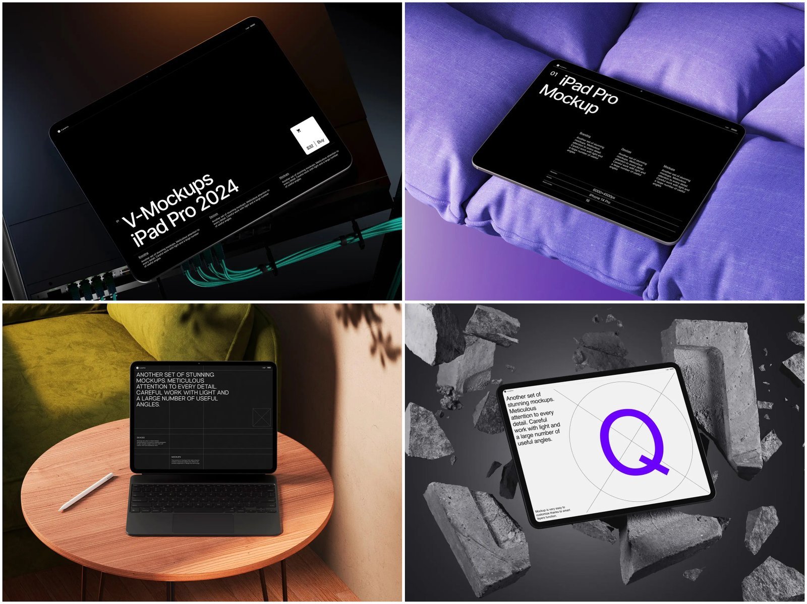
iPad Mockups on ls.graphics: Quality You Can See
The library at ls.graphics is a resource for those who take their visuals seriously. The iPad collection stands out for several reasons.
The rendering is ultra-realistic: light, materials, shadows — nearly indistinguishable from a photograph. Layers are organized and clearly labeled, so swapping a background for a new season takes minutes. The angle variety — from straight-on to isometric, from close-up to flat lay — lets you build a diverse campaign without repetition.
Color style flexibility means the same device looks equally at home in a dark Black Friday scene and a bright New Year’s flat lay. Minimalistic compositions come pre-built — even without deep design skills, you can put together a professional visual quickly.
For those who want to try before committing, there’s a generous selection of fully usable free scenes — not stripped-down previews. And the Edit Online feature lets you customize mockups directly in the browser, with no Photoshop or Figma required.
Conclusion
Seasonal adaptation is the difference between a visual that exists and one that actually sells. Match your mockup to the mood of the moment, let the composition tell the story, and build on a foundation of quality assets.
That foundation is exactly what ls.graphics offers — professional tools for those who take visual marketing seriously. Start with a free scene and see for yourself.